Often, a non-photographer will ask me if I “Photoshop” my photos. My answer is usually something like “I don’t use Photoshop, but I do process my photos.” The follow up is usually some version of “why.”
As we photographers know, cameras today give us lots of latitude for exposure adjustments, which is what I use the most, along with straightening horizons (a lot!), removing dust spots (almost as much!), cropping, contrast & saturation adjustment, and more. And while it is possible to get way beyond reality, I tend to try – as we all do – to improve upon reality just a bit.
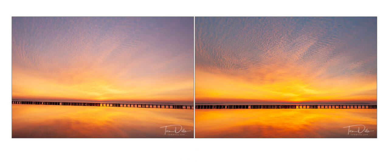
After (L) and Before (R)
Ansel Adams is credited with the words “Dodging and burning are steps to take care of mistakes God made in establishing tonal relationships.” A bit modest, perhaps, but that pretty much summarizes – with a bit of humor – what we do and why.
After (L) and Before (R)
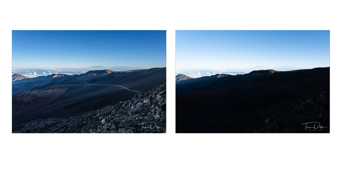
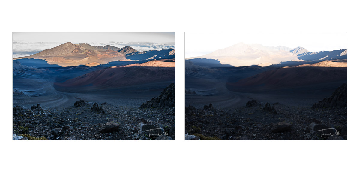
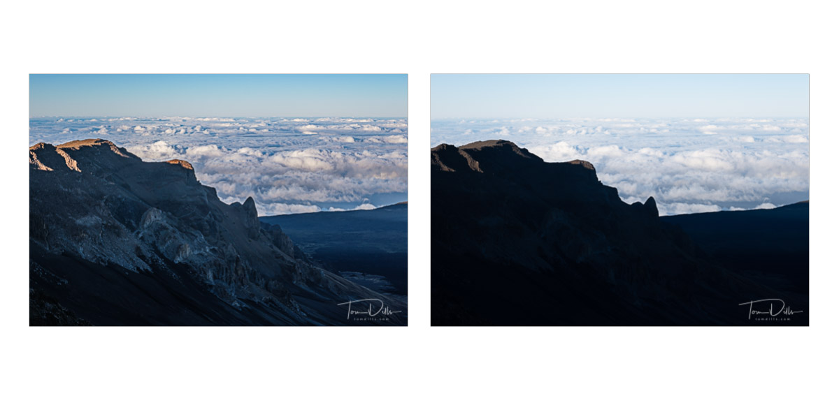
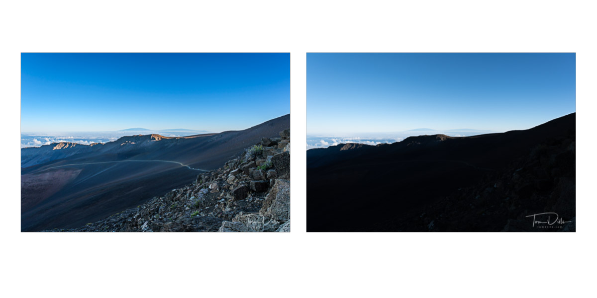
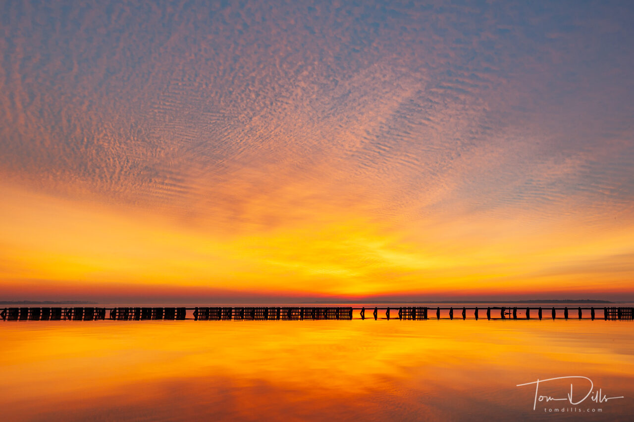
Here are 4 photos I made at the summit of Haleakala that show what I mean. The ideal time to get even lighting in the crater is when the sun is directly overhead. But that unfortunately is one of the hardest conditions to photograph anything else! So I did my best to counteract the highlights and shadows in order to bring everything back to what my eye was able to perceive.
A little photo-geekery here. Apologies to the non-photographers. 😉
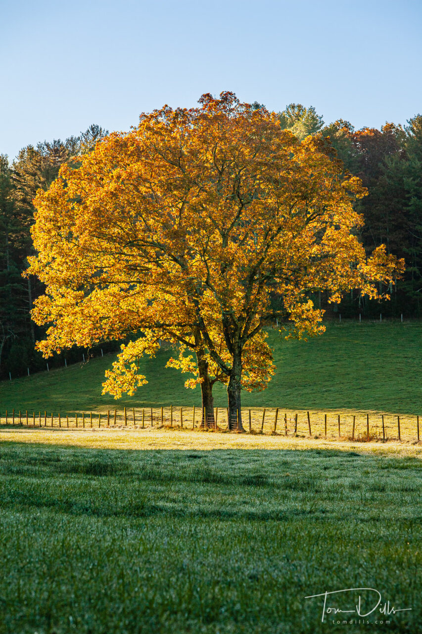
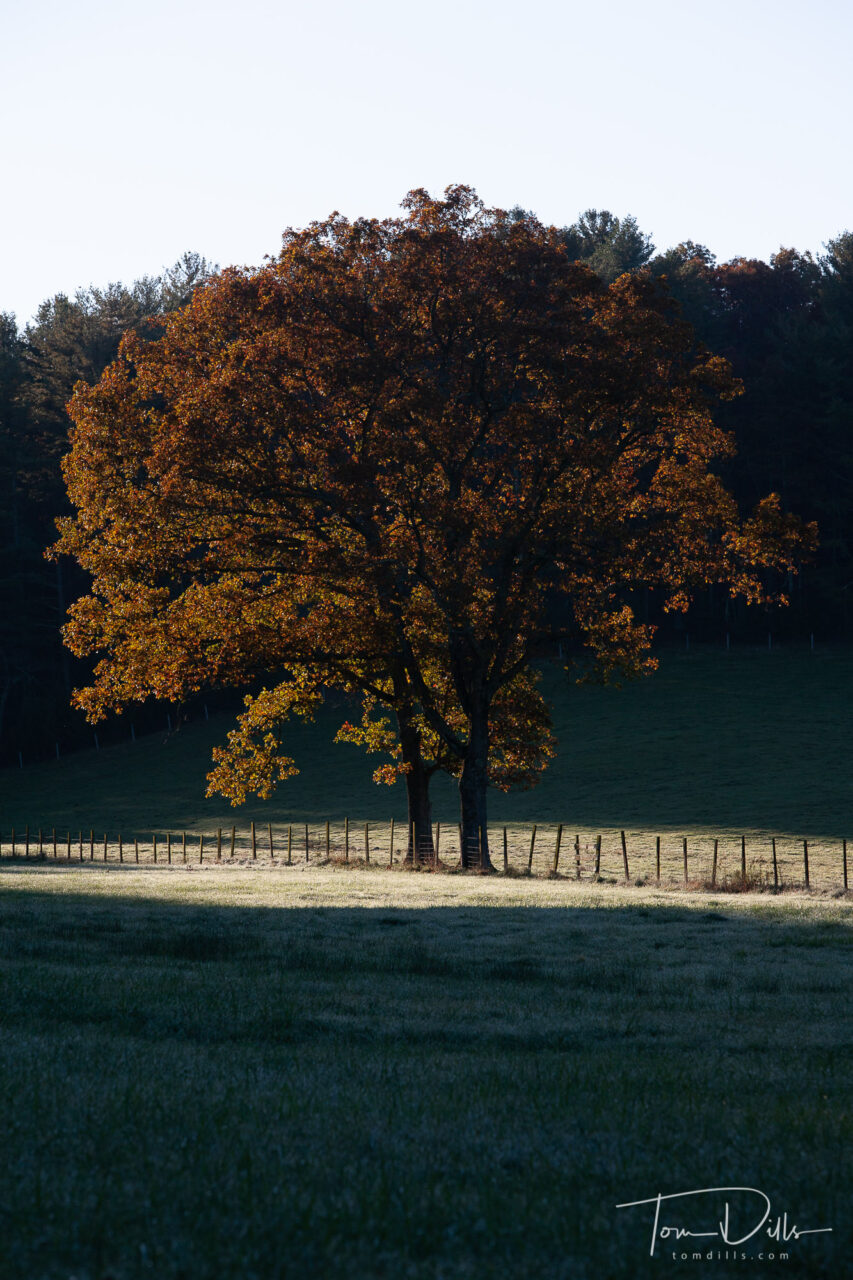
I took this photo back in the fall of 2011 along the Blue Ridge Parkway in southern Virginia. The tree was aglow in fall color and the light made it explode out of the surrounding hillside. I purposely under-exposed by 2 stops so I wouldn’t lose the sky or saturation in the golden leaves. But try as I might I just couldn’t get a final image that captured what I saw. Image #1 is the original file without processing, and Image #2 is my best attempt at that time.
Original RAW File – No Processing
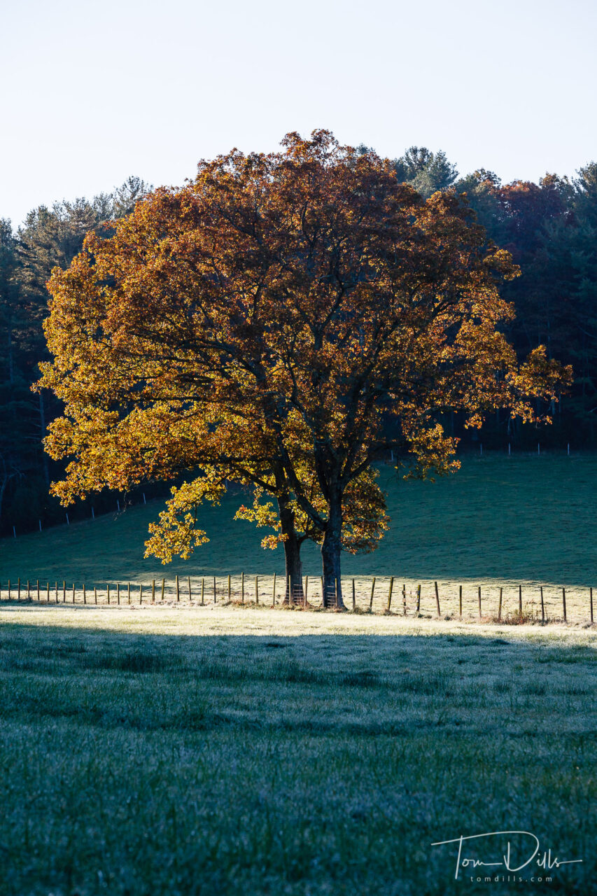
When I was looking for photos to accompany my “trees” post I came across this image and decided to give it another try. I updated the Process Version to the latest one and took advantage of the latest masking and toning tools in Lightroom. I finally got the image I was looking for originally! Or at least very close to it. I may mess with it some more, but I’m happy to have broken the code on this one.
2011 Processed Version – Reject!
I just hope it doesn’t “force” me to start looking for old files to process…I have a hard enough time keeping up with the current stuff! 🙂
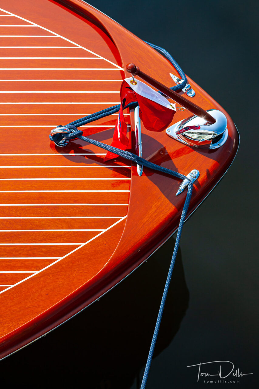
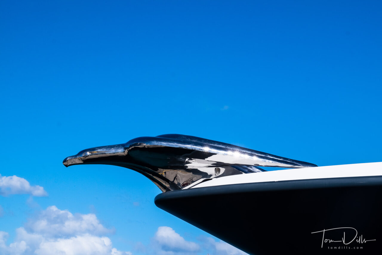
Charlotte Antique and Classic Boat Show at Queens Landing in Mooresville, North Carolina
I’ve been working recently (with both “working” and “recently” having quite a broad definition 😉 ) on a long-overdue update to the galleries on my website, and it has been an interesting project. Years ago when I was doing assignment work, teaching classes and giving talks to photo groups, I thought of my website as more of a way to show off my work and validate my skills, and never really looked at it as a marketing tool. I would occasionally sell a print, or have an art consultant contact me about buying prints or licensing some images. All of that worked pretty well despite the fact that I really hadn’t set it up as a sales site. I suppose I could have worked harder at it and turned it into something, but I was working at the time and just didn’t feel inclined.
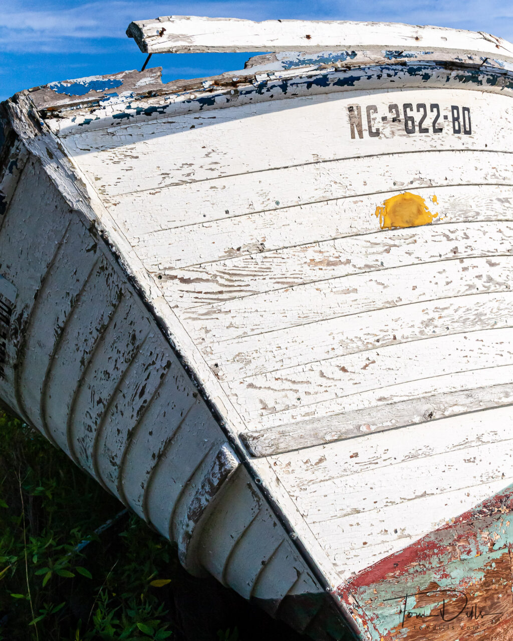
Abandoned boat on Stumpy Point, North Carolina
At this point in my photographic journey, I’ve gotten away from anything that looks, feels or smells like running a business. I’m retired and want to keep it that way. I photograph for fun, share my work with a few people who appreciate it, and don’t expect people to pay me money (but not complaining when they insist!). My website is still the public face of my photography, and I think a lot about what I want that to be for me. In the past I have tried to limit the work on my website to my “serious” work, preferring to put my “vacation snaps” on my blog or on another website such as Google Photos, or now, Adobe Portfolio. Do I change that and put all of my photos on my website? Do I ditch the website altogether and use one of the free (or less-costly) services? Part of me says that since I’m paying for my website I should use it for everything, part of me thinks I’m paying a lot of money unnecessarily but yet another part of me thinks I should keep things as-is, with my website devoted to my more serious stuff and using Adobe Portfolio for my “snapshots.”
Fort Lauderdale, Florida
The main advantage to using Adobe Portfolio is how well it integrates with Lightroom on my computer. I can create a Synced Collection of photos that automatically uploads Smart Previews to the online version of Lightroom. From there I can quickly create a gallery in Adobe Portfolio to share with others. There aren’t a lot of options, but it’s OK for my use. Uploading to my website requires a few extra steps and is a little clunky. It works OK but isn’t ideal for frequent updates or high volume galleries.
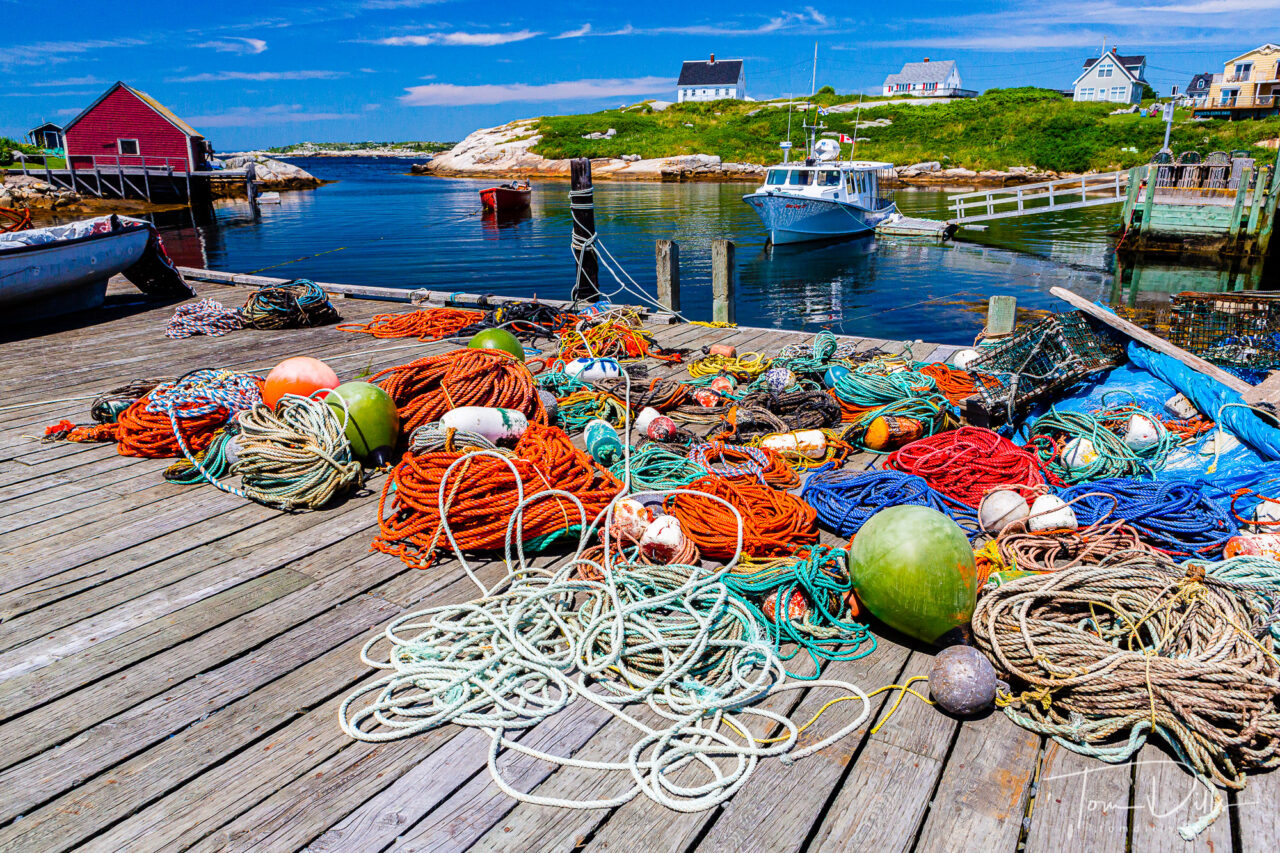
Peggy’s Cove, Nova Scotia
I don’t have web skills and don’t know my WWW from my HTTP or my SQL (assuming I even have those!). So I rely on a template-based site that gives me a few good layout options and generally just makes some nice looking galleries. Years ago I started with Neon Sky, a Charlotte-based web company that several of my friends were using. It’s not as fancy as some of the more heavily advertised services, they aren’t as quick with updates as I would like, and it probably costs more than I need to spend for what I do. But it works for me and I don’t really want to invest more time and effort into making a switch.
Hall’s Harbour, Nova Scotia
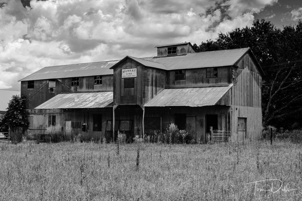
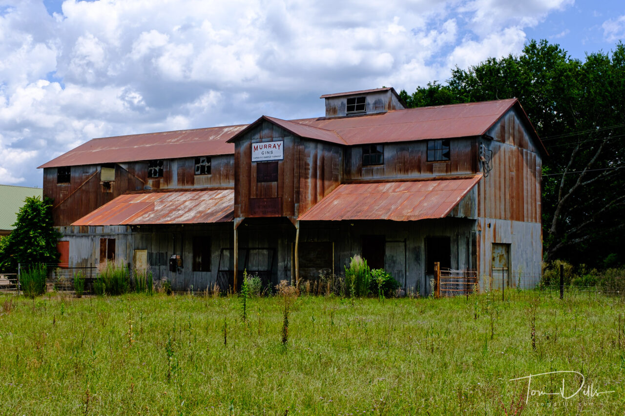
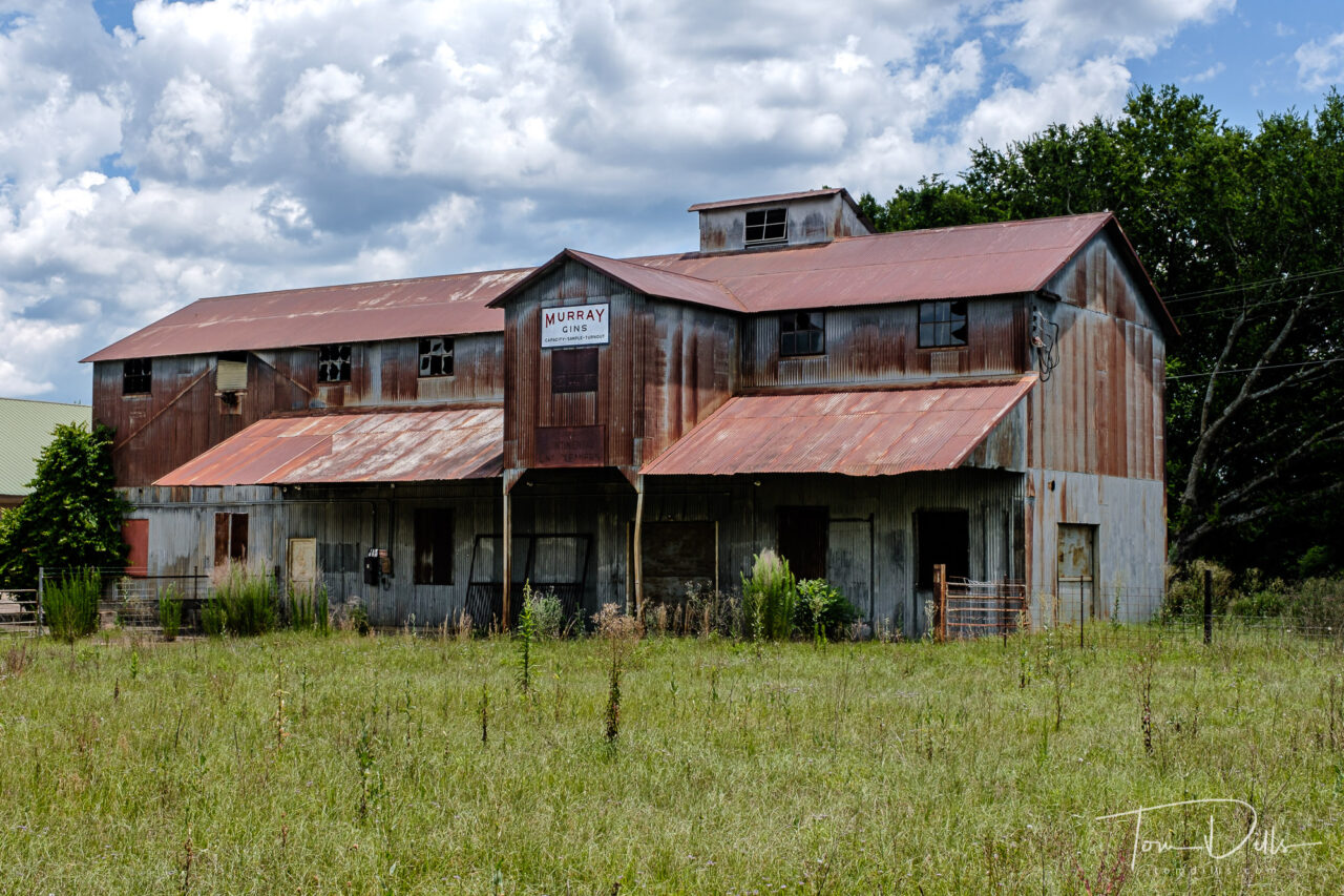
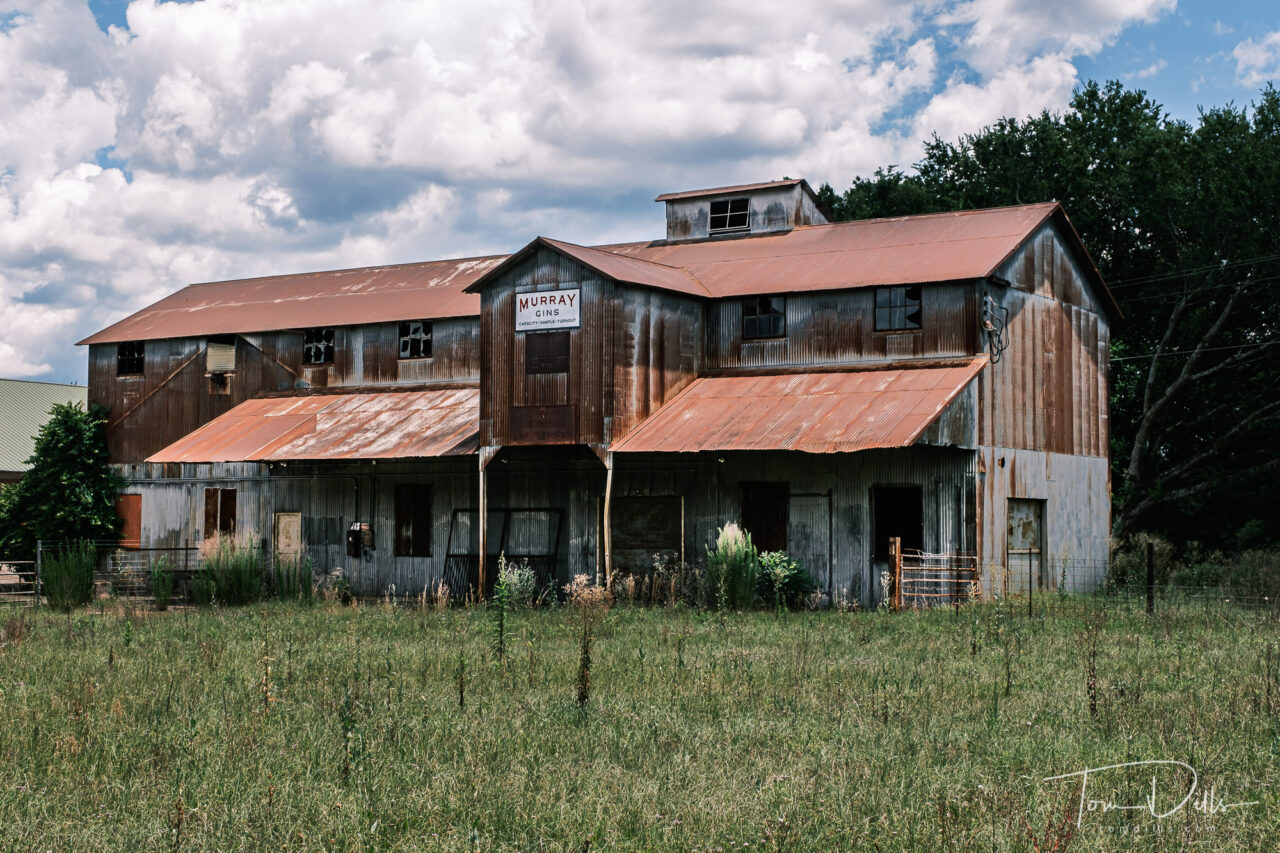
But as the title of this post suggests, what I really want to do is to come up with a better way to organize my photos. My current galleries consist of simple subject names: Color, Glory, Flow, Form and Peace plus a bunch of galleries under the heading of Projects. It feels to me like one of those graffiti rocks that have had so many layers of paint added to it over the years to the point where you can’t tell what the original shape was. Most of what I post fits into those broad categories, but I feel like there should or could be so much more. What about the Rust and Peeling Paint? How about the abstracts, or the close-ups, or candid people shots? I’ve got critters and signs and urban landscapes and more, but without ending up with 20 or 30 galleries that would confuse the heck out of people and make them give up and go back to YouTube, how can I classify my photos more specifically in order to make my galleries into cohesive “bodies of work?” I’ve been working on that, and it has been a challenge in a number of ways.
Neil’s Harbour, Nova Scotia
Starting from scratch with a collection of 80,000 images is overwhelming, so my first challenge was how to start with a much smaller sample. Fortunately I’ve been pretty diligent over the years with using Collections in Lightroom, and I have a well-developed method for rating my photos. I’ve also been diligent about using captions and keywords to help me locate and organize my photos. Using star ratings I narrowed the first pass down to about 6,500 photos – still a daunting task but somewhat more manageable than 80,000.
Neil’s Harbour, Nova Scotia
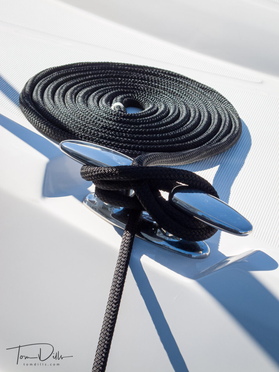
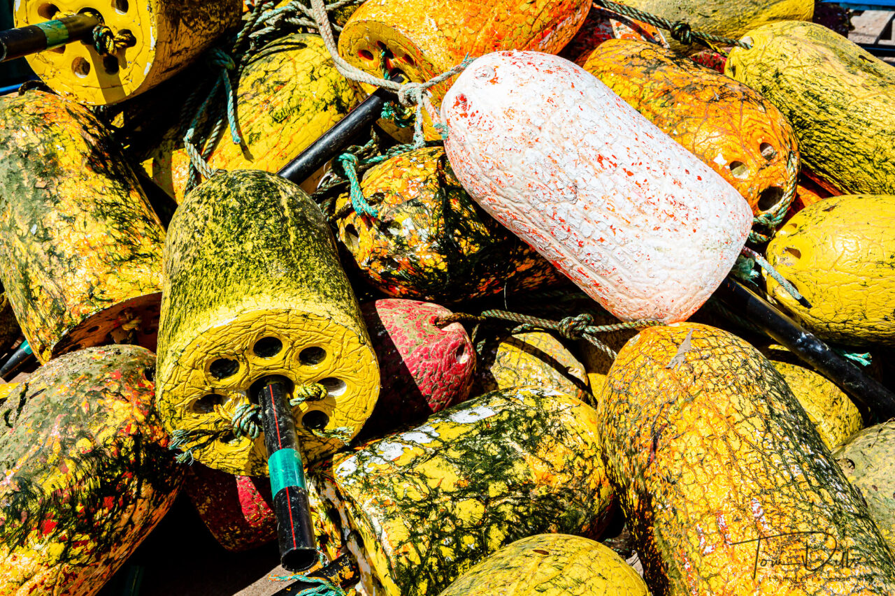
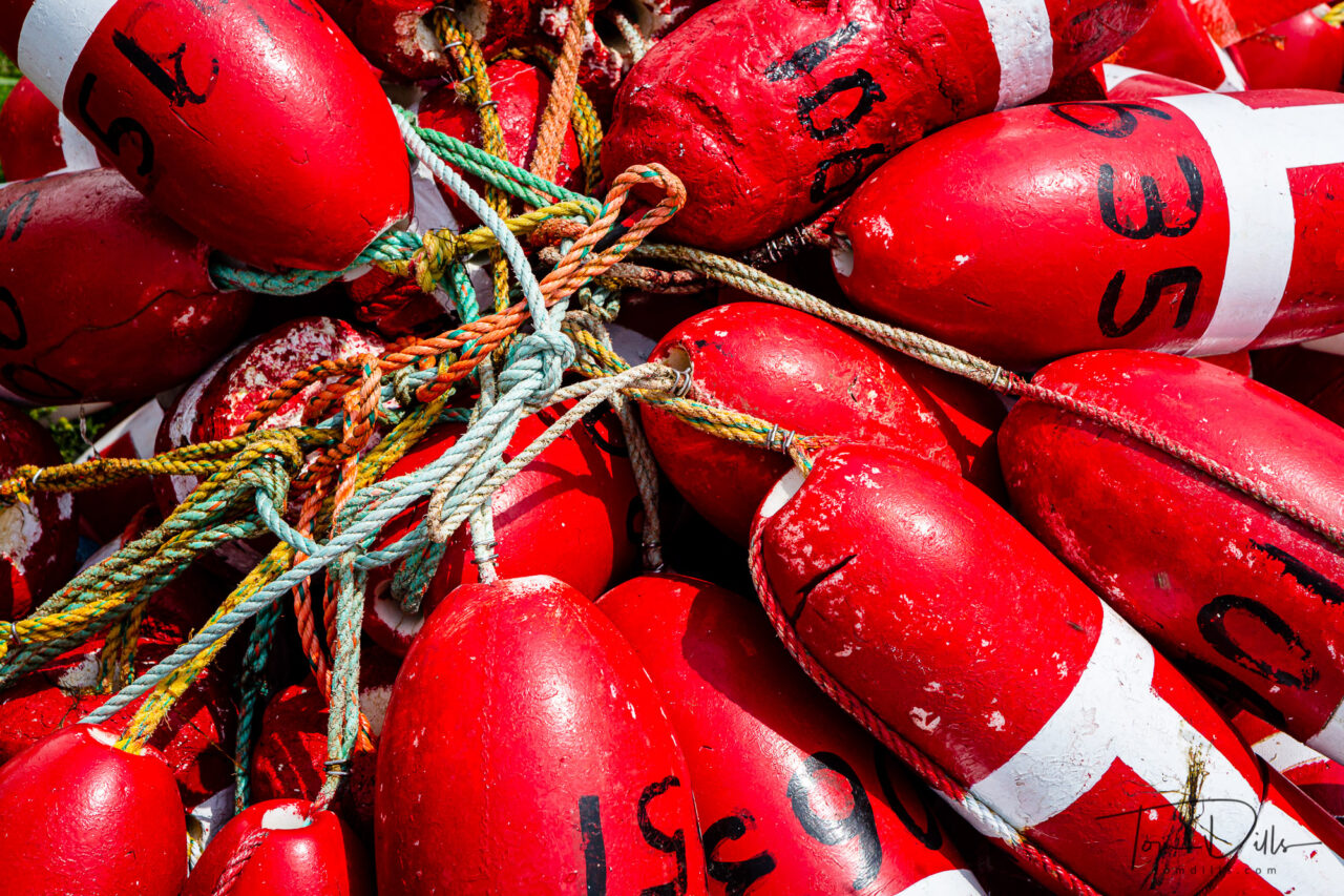
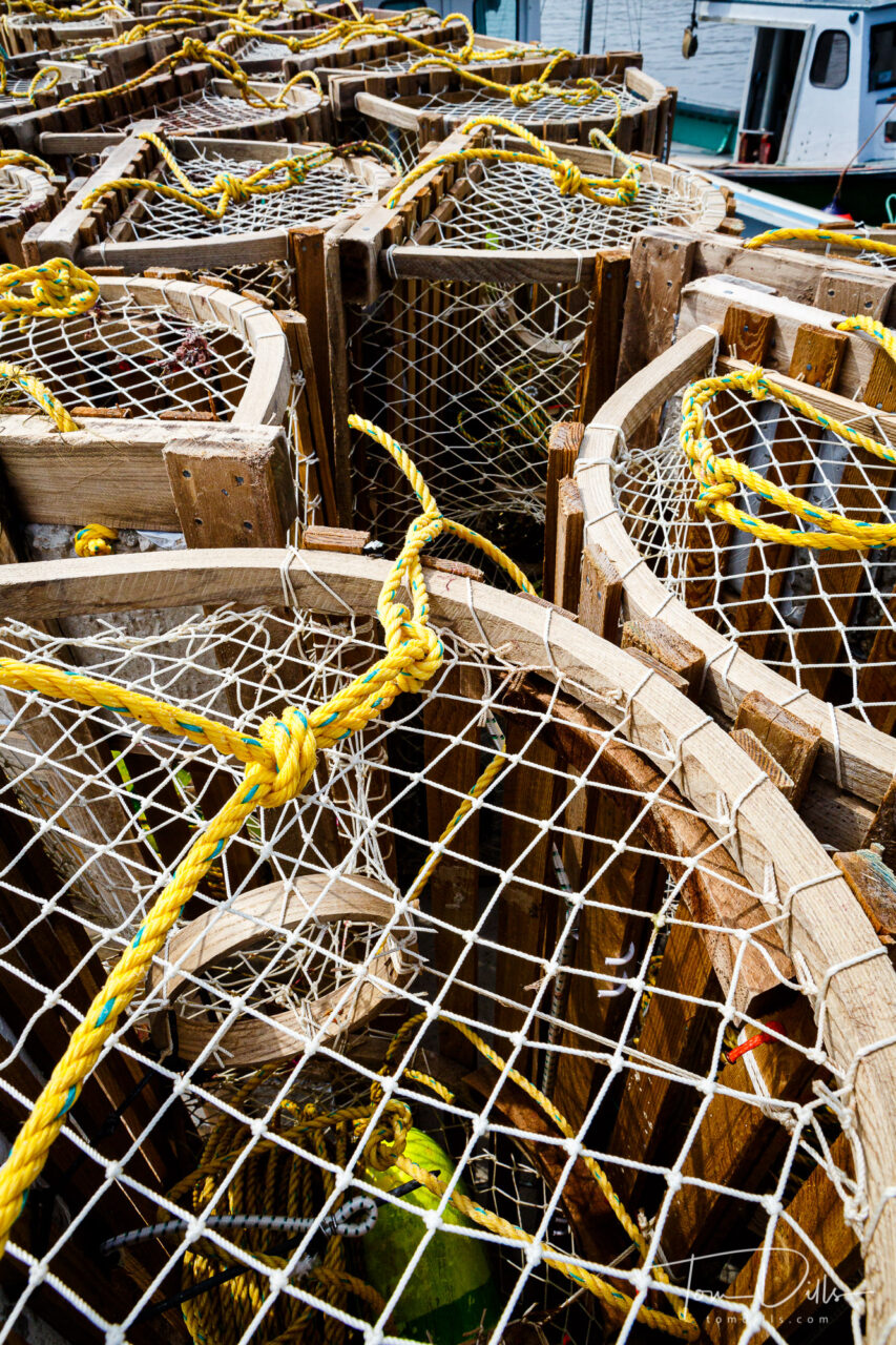
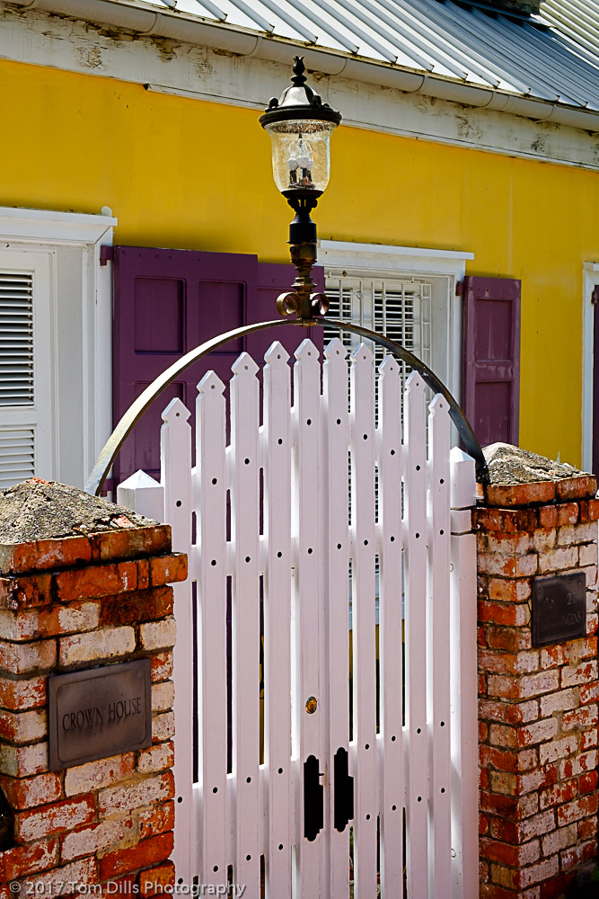
I’ve made lists and lists of possible theme titles and have given a lot of thought to what the definitions should be for each theme. Then comes the hard part – going through my photos to figure out which ones fall into which categories and making sure I have enough decent photos to properly fill out a gallery for each one. For someone prone to overthinking and second guessing (me!) that can be especially challenging. For example, one of my potential themes is “Nautica,” which I have defined as “Boats, parts of boats and boat stuff.” In my mind I’m thinking more of the details – ropes, sails, ornamentation, etc. and less about pictures of boats themselves. But what do I do with the boat pictures? Do lighthouses go there or somewhere else? How about cruise ships? Landscape photos that have boats in them? Crab pots or buoys? Of course the answers to all those questions are “it depends” and “they’re my rules, it’s up to me.” Sheesh. A few of my favorites accompany this post.
Yacht “Phoenix” in St Martin
It’s interesting how many ways there can be to slice and dice photos. A number of them will fall into multiple categories. Do I put some of them in several galleries or decide which one is “best?” Decisions, decisions. This has been an interesting exercise so far. I’m nowhere near the end and it still seems awfully overwhelming, but I hope the results are worth the effort when I’m done. I make no promises for when that might be! 😉
This is a bit of a photographers-only geek post, so bear with me. 😉
The latest update to Lightroom includes a set of “Premium” develop presets that were reportedly developed by photographers for use in streamlining the develop process. I’ve generally not been a fan of “canned” presets because I kinda have my own preferences and like to maintain control over my processing. But there is value to considering other approaches, and sometimes these presets are worth looking at, if only to get an idea for what is possible.
This morning I decided to take one of my photos from our recent road trip and try out the 10 presets contained in the “Travel” section. The results were pretty interesting so I thought I would share. The nice thing is that – as opposed to some of the previous presets – packaged as “Profiles” these appear to affect color balance and saturation and leave the other settings – noise reduction, sharpening, exposure, etc. – alone. I’ll learn more as I mess with the other ones, but I like the idea of coming up with variations just to see what they look like.
No conclusions here – just for evaluation and discussion. If anyone has comments – on the processing, not the photo 🙂 – I look forward to reading them.
Processed with Lightroom Preset TR01Processed with Lightroom Preset TR02Processed with Lightroom Preset TR03Processed with Lightroom Preset TR04Processed with Lightroom Preset TR05Processed with Lightroom Preset TR06Processed with Lightroom Preset TR07Processed with Lightroom Preset TR08Processed with Lightroom Preset TR09Processed with Lightroom Preset TR10
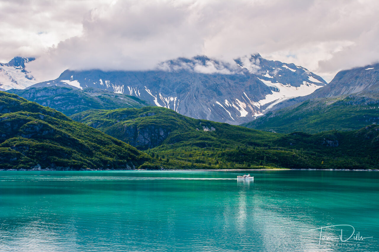
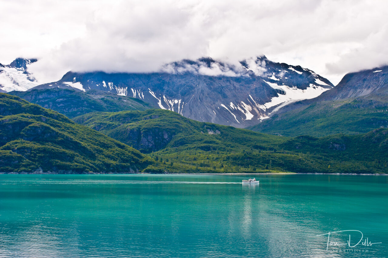
NEW VERSION: Glacier Bay National Park and Preserve, Alaska
I’m going back through my old photos for a website update. This one is already on my website, but I thought I would see what the current software (and my current Lightroom chops) could do with some of the files. This is the first one I’ve tried this go-around, and I think I’ve made significant improvement.
I made a Snapshot in case I messed something up, then hit Reset. Using the Adobe Landscape profile, I went though my usual routine with contrast, etc. I added a gradient to the sky, using a Luminance Mask to apply the settings only to the lightest parts. Overall contrast and saturation is much better, which is hard to see in the web versions.
It will be interesting to see what I can do with other files. This may take a while…. 😉
Canon 20D w/17-40 f4
PREVIOUS VERSION: Glacier Bay National Park and Preserve, Alaska
The photo in my previous post was processed using the “Vintage 01” profile in Lightroom. My default setting is usually an Import Preset I’ve developed using the “Camera Velvia” profile, with some of my own secret sauce. The Velvia version with that subject came out way too saturated, so I started messing around with a few other treatments. I created new Virtual Copies, changed to a new profile then made a few additional tweaks based on what I thought each version needed.
Original with Velvia Profile
No verdicts or preferences at this point, but it was interesting to see what the different options can do.
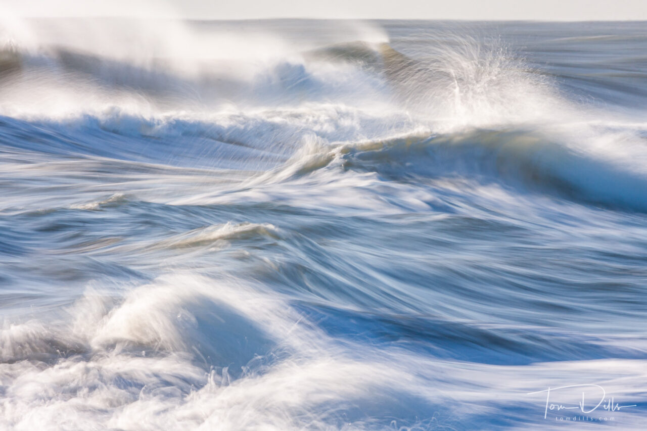
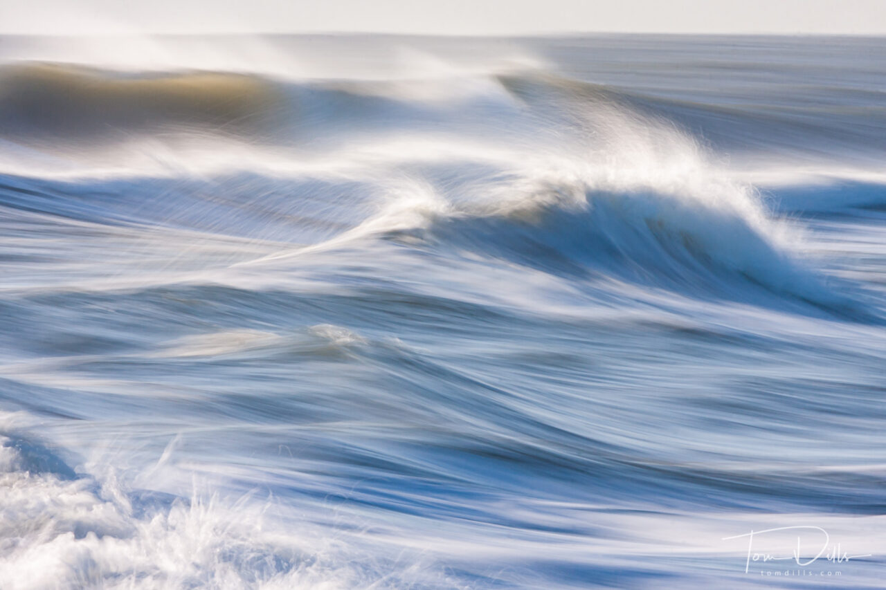
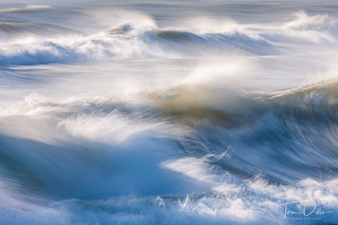
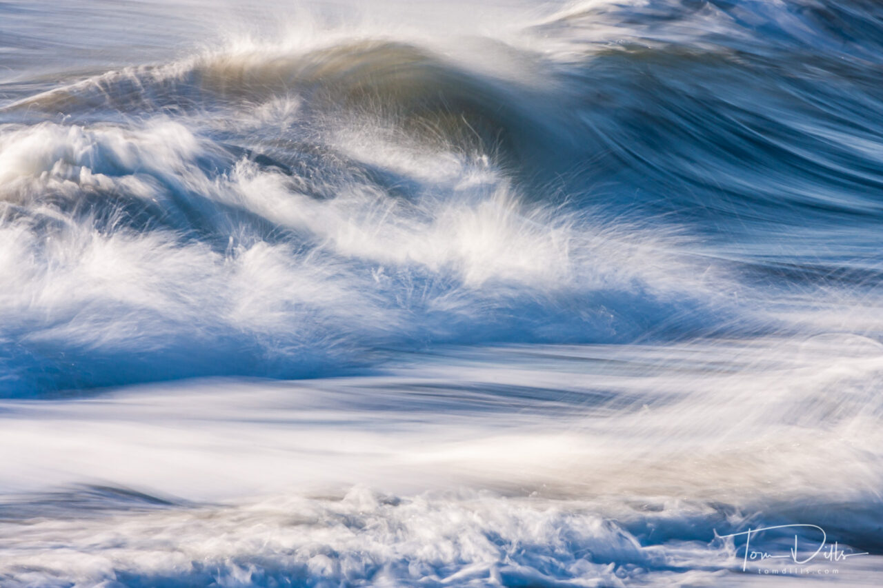
Angry surf on the beach at Chincoteague National Wildlife Refuge, Virginia
I’ve been going back through old image folders looking for unprocessed photos that are worth spending time with. I recently came across some photos from a visit to Chincoteague, Virginia in 2010.
Angry surf on the beach at Chincoteague National Wildlife Refuge, Virginia
The ocean was particularly angry one morning, and I remember standing on the beach shooting the surf while trying to keep myself and the camera dry from the salt spray. In order to slow the shutter speed down enough to show the motion, I had stopped my lens down to – according to the metadata – f40. I didn’t remember having a lens that stopped down that much, but sho-nuff the old Canon 100-400 did!
Angry surf on the beach at Chincoteague National Wildlife Refuge, Virginia
Of course, at f40 every dust spot on the sensor is going to be visible, and on some of these photos there were dozens, perhaps a hundred or more. It’s a pretty safe guess that the reason these photos hadn’t been processed was because of all the spots. I’ve never been meticulous about cleaning my sensor, and it shows. But one of the advances in Lightroom that I am now able to take advantage of is the Spot Removal tool. The technology has improved dramatically over the last 10 years, to the point where I was able to salvage this photos. It involved a lot of clicking and a certain amount of adjusting, but a lot less futzing than I would have had to do back then!
Angry surf on the beach at Chincoteague National Wildlife Refuge, Virginia
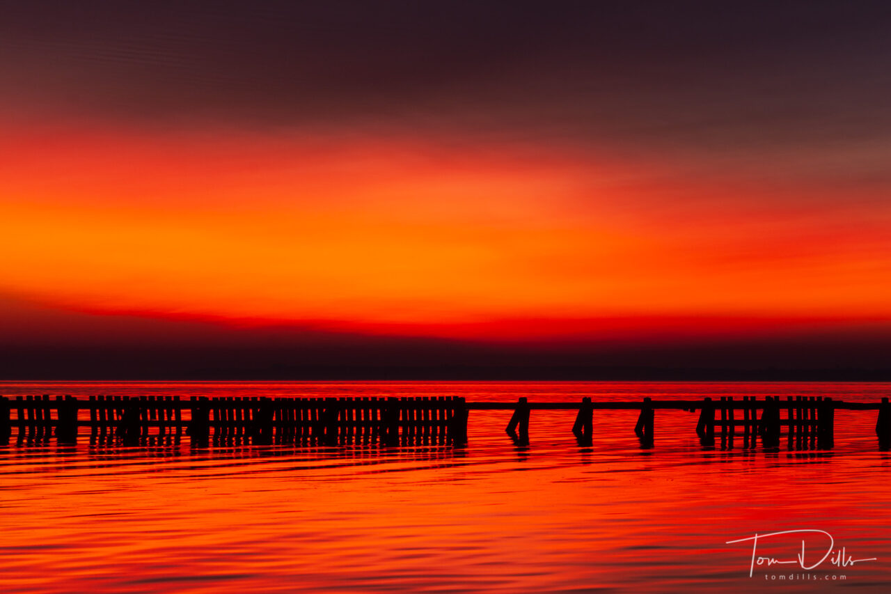
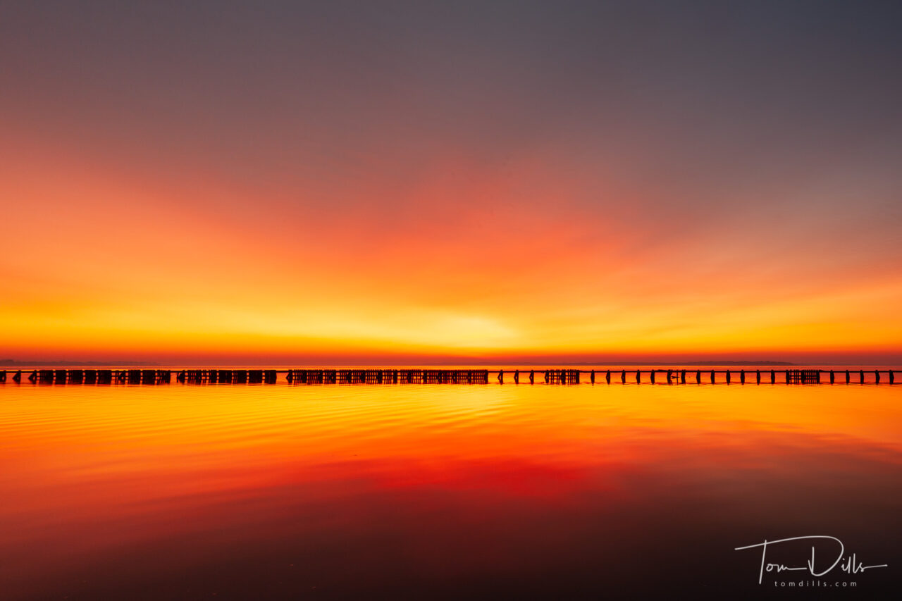
Sunrise along the waterfront in Belhaven, North Carolina
One of the more recent additions to Lightroom is the “Transform” function, in particular the perspective correction tool. I find myself making use of this tool a lot, as it “corrects” photos where I’m forced to shoot from an angle – side to side and up to down – and making them look normal. I don’t generally use it to “cheat” but rather I like to use it when I don’t have a choice about where to stand.
Sunrise along the waterfront in Belhaven, North Carolina
I’ve been going back through some old unprocessed photos and came across a group of sunrise photos from 2010 in Belhaven, North Carolina. One of the distinguishing features of the harbor in Belhaven is a break wall that separates the harbor from the larger Pungo River. The break wall is a well-recognized landmark of this area, but the problem I always have with it is that it doesn’t run perpendicular to the places I photograph from. As a result, there is always a perspective mismatch between the horizon line and the line of the breakwall. They never looked right when I processed them, so I’ve always been hesitant to use them for anything. Until now.
Sunrise along the waterfront in Belhaven, North Carolina
Looking at this photos, I wondered if the perspective correction in Lightroom could be used to “fix” the position of the breakwall so it looked “right” in my photos. Lo and behold, it does! There is a little bit of falloff in focus in the areas that are actually father away, but it’s hardly noticeable. And yes, I could have done this a long time ago in Photoshop. But that misses my point. And of course, someone who lives there and is used to the view would likely recognize the change immediately. But for most folks, they wouldn’t notice the difference.
I’ve attached a couple of photos as examples, including one “before & after composite. I think it turns a photo that never looked quite right into one that looks pretty good for all but the pickiest few among us. And chances are they don’t read this blog! 🙂
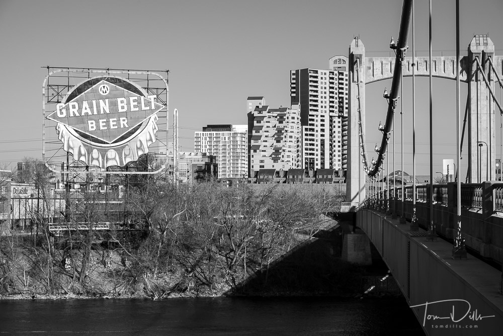
Hennepin Avenue Bridge over the Mississippi River in Minneapolis Minnesota
I don’t usually get too excited about software, but the most recent update to Lightroom has me pretty intrigued. Most of the changes were cosmetic in nature, related to the layout of certain menu items. But Adobe has introduced some new and improved Develop profiles that I really like. I’ve never been able to come up with black & white conversions that I was consistently happy with, but some of the new profiles are pretty sweet. I might even give Monte a run for his black & white money! The color profiles are pretty nice too. I’m still working and fiddling with them, but I think I may have found some new tools!
Long-time readers will recall that a little over 3 years I embarked on a project to build my own computer. With my son’s expert assistance (as in he did all the hard work) I built a PC from parts and installed Apple’s OSX on it – a “Hackintosh.” I had been a Mac user for a long time, originally purchasing a Powerbook, then an iMac and more recently a MacBook Pro. I needed a new computer then and liked the idea of building my own, and was intrigued by the idea of running OSX on it.
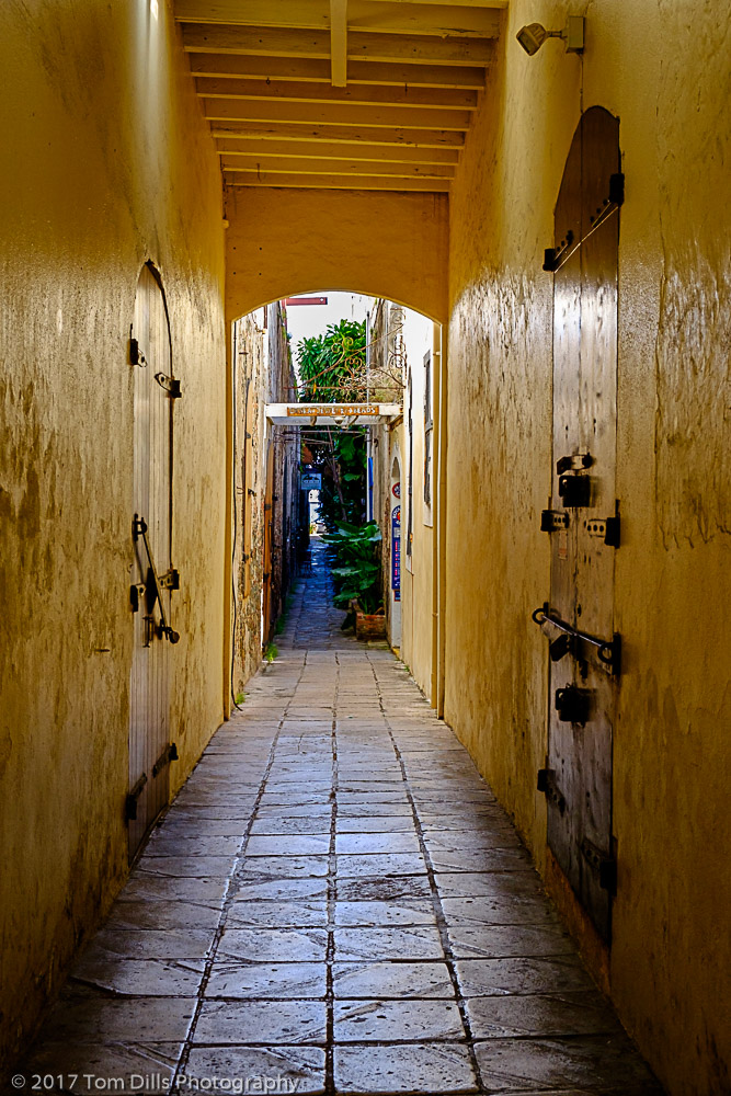
Wandering the streets of St Thomas, USVI
For those who like messing around with computers, building a computer can be a fun and interesting challenge. For people like me who mostly just want to have a reliable and reasonably competent tool, the time and effort required to keep up with software updates and the workarounds required to run a non-native program on a computer got to be more than I was interested in doing. More recently I started running into problems with the App Store telling me that the software was up to date, but the part that Adobe CC looks at to determine if I am able to run the latest version of their software thought it was an older version. The steps required to fix that problem didn’t seem to work, and I finally decided to make a change. Also, I was never able to get my Canon printer to run on the Hackintosh.
The Hotel 1829 in St Thomas, USVI
My choices essentially came down to two. I could shell out the money for a new Mac, but new Macs are quite pricey these days, and the ones that I thought I needed to do the job are several years out of date. Probably OK for my needs, but I was having a hard time with the idea of spending a bunch of money on a new computer, just to end up with my current box sitting idle and useless. My second option was to install Windows on my current computer and run the software for which all the parts were intended. It’s still a very capable computer, with a fast processor, 500GB SSD and two 2TB hard drives, lots of memory and a good video card. So that was what I decided to do.
Wandering the streets of St Thomas, USVI
With my son’s help (gracias, Kevin!) I mapped out the steps required to replace everything I used on the Mac with its equivalent on Windows. And it actually wasn’t much because I don’t use a lot of stuff – the two biggest challenges were (1) moving my photo files – 4 hard drives in all including backups – from Mac-formatted hard drives to Windows-formatted hard drives, and (2) finding a suitable replacement for my backup software.
Wandering the streets of St Thomas, USVI
The Mac vs. Windows arguments have been going on for years, much like the Canon-Nikon-Fuji-Olympus-Sony-Etc. arguments for cameras. But when it comes right down to it there just isn’t a lot of difference between them these days. I use a Windows computer at work, so other than having to remember to close or minimize from the right instead of the left, they’re essentially the same. Lightroom and Photoshop look and act the same, Chrome looks the same, and Office for Windows is pretty much the same as Office for Mac. A few other odds and ends and I’m pretty well covered.
Wandering the streets of St Thomas, USVI
I’m not going to go into a lot of details on how I solved the two problems because I don’t have the expertise to answer questions. For the transfer of photos I purchased software from Paragon Software called HFS+ for Windows. That allowed me to see the Mac-formatted (HFS+) hard drives so I could copy the data over to newly-formatted Windows (NTFS) hard drives. I originally intended to use Paragon’s Backup & Recovery software, but just couldn’t get comfortable with how it worked. I ended up buying GoodSync, which works more like the SuperDuper that I used on the Mac. There is no Windows version of SuperDuper, but GoodSync comes pretty close. I may experiment with other software, but so far it seems to do the job.
Wandering the streets of St Thomas, USVI
At this point I’m most of the way finished with the conversion. My two external backup drives are still in Mac format, as I want to be sure that all the Windows stuff is operating correctly before I wipe out those drives and copy the backups to them. There is probably a slight risk there, but I think it is wise to be sure before committing. And I haven’t tried to hook up the printer yet. Hopefully this weekend will give me time for that project. Since it involves starting up the printer and wasting a certain amount of ink, I want to be sure I have adequate time to complete the process!
Aboard Norwegian Epic departing St Thomas
So that’s pretty much it! Over the course of the last 18 months or so I’ve gone from a Canon user to a Fuji user, and from a Mac user to a Windows user. But I’ll bet you won’t notice any difference in my photos from either move. And hopefully I’ll be able to forget about the computer for a while and just go take photos!