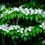
Dogwood in the gardens of the Biltmore Estate in Asheville, North Carolina
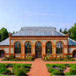
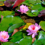
The Conservatory. In the gardens of the Biltmore Estate.
The Conservatory. In the gardens of the Biltmore Estate.
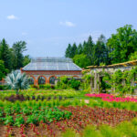
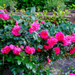
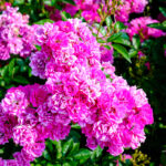
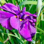
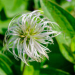
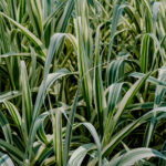
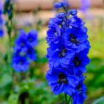
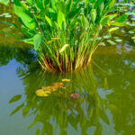
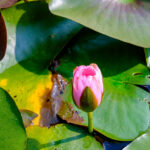
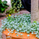
Flowers in the Walled Garden of the Biltmore Estate
Flowers in the Walled Garden of the Biltmore Estate
Flowers in the Walled Garden of the Biltmore Estate
Flowers in the Walled Garden of the Biltmore Estate
Flowers in the Walled Garden of the Biltmore Estate
Flowers in the Walled Garden of the Biltmore Estate
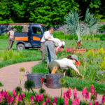
A gardeners work is never done. The Walled Garden of the Biltmore Estate
Gardening tools. The Walled Garden of the Biltmore Estate
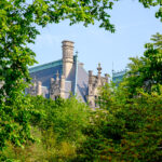
View of the Biltmore House from a path in the gardens
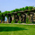
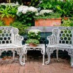
Trellis along the South Terrace of the Biltmore House
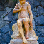
The Italian Garden at the Biltmore Estate
The Italian Garden at the Biltmore Estate
The Italian Garden at the Biltmore Estate
The Italian Garden at the Biltmore Estate
The Italian Garden at the Biltmore Estate
The Conservatory. In the gardens of the Biltmore Estate.
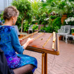
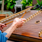
Hammered Dulcimer player at the Conservatory in the gardens of the Biltmore Estate.
Hammered Dulcimer player at the Conservatory in the gardens of the Biltmore Estate.
The Conservatory. In the gardens of the Biltmore Estate.
The Conservatory. In the gardens of the Biltmore Estate.
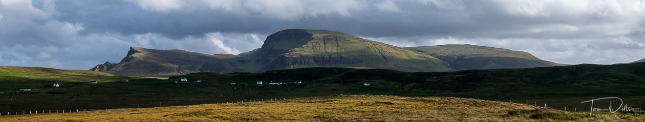
Biltmore Village in Asheville, North Carolina
Last week, Kathy & I ventured to the Biltmore Estate in Asheville to take in the spring flowers in the gardens, check out the Renaissance Alive art presentation, and of course to eat and to buy wine. 😉
Biltmore is an easy 2 hour drive from Charlotte, suitable for a day trip but also a nice way for an easy overnight. We had reward points that allowed us to stay for free at a motel in nearby Biltmore Village, so we had the better part of two days. As Annual Passholders we didn’t have to pay extra for the visits, which can otherwise be a little pricey.
Even without visiting Biltmore House itself, the grounds and gardens are such a nice place to spend a day or part of the day. The gardens are extensive, and the Conservatory itself is larger than most homes. We concentrated mostly on the outside gardens, although as we were getting ready to leave, the sounds of a hammered dulcimer drew us inside for a listen.
6 thoughts on “Spring Splendor At Biltmore”
Lovely series of images and a good mix. Road trip or overnight it really does work for you. I really like the water buckets and boots image! Thanks for sharing.
Yes, I really wanted to crop out that electrical box in my composition, but doing so would likely have required getting down on my belly! 🙁 Not something I’m generally inclined to do, even for a photograph.
We need to do more of these close-to-home shorter journeys. There are lots of interesting sights that people come to see that we have never seen, and we have traveled long distances to see things in others’ back yards. Something to see everywhere! 🙂
Great photos. We visited there a year ago. Beautiful place
Thanks, Howard. There is plenty to see and do there, for sure.
Another great series (as expected). Biltmore is a wonderful visit and there is always so much to capture.
The intense red/pinks look a bit too saturated and unnatural on my monitor (new iMac only a few months old). I seem to have the same issue with some of my images. That particular hue is very tough to get right where as most other colors can look good with high saturation. I had the same issue with my old iMac and my iPad Pro. I have not run my Datacolor calibration tool on the new Mac but it never solved the issue on the old. Perhaps this is an Apple thing? Do you see any issues on your PC?
Hi John –
I used a custom Velvia-mimicking preset on these photos, and they do tend to be a bit contrasty and saturated as you might expect. But on my monitor they look fine, not overdone. The actual pinks were pretty intense. If anything, the greens tend to be a little on the rich side to me, but that is the nature of the preset.
I’d be interested to see if anyone else is seeing what you are seeing, or if anyone has any feedback related to the Mac vs. PC perception.
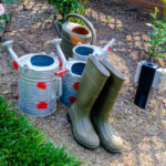
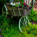