Generally when I am in the process of taking a photograph, I have a basic idea what it is going to look like when I am finished processing it. When I’m sitting at the computer working on an image, it just sort of “develops itself.” Most of the time the direction I need to go with an becomes pretty clear to me. I open up an image in Lightroom, work on it a bit, and after a few basic tweaks it is pretty much done. Unless I’m going to make a print, there isn’t a whole lot more I do.
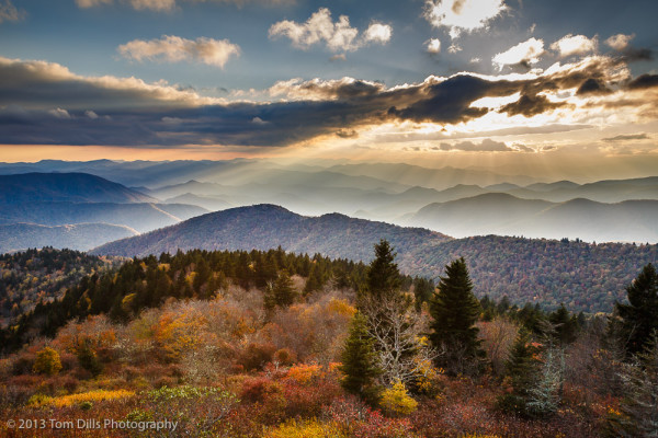
This particular photograph has me a little perplexed. I processed it exactly how I expected to. It’s a little more processed than usual, but there’s quite a lot of dynamic range going on here. But for some reason, I just can’t seem to get comfortable with it. There’s nothing really “wrong” with it, in fact a lot of people would probably wish that they had taken it themselves. But for some reason I am struggling with it.
It’s a typical Cowee Mountains Overlook sunset. It’s got a nice sky, detail in the foreground, and there’s a lot going on. Too much, I think. It is a very “busy” image, as opposed to a lot of my photographs that are a bit more simplified. I’ve definitely processed it a lot more than I usually process an image. Maybe that’s it, I’m not sure.
I think the thing that I keep coming back to is that it doesn’t seem like it’s mine. It’s the sort of landscape photograph that I’ve taken for years, but I just can’t seem to connect with this one. No, I didn’t switch memory cards with someone by mistake, but it’s just such a departure from the type of photography I’ve been doing recently that I may just have to spend some time with it to figure it out. In the mean time, it just doesn’t feel like my style, and I find that interesting.
Hi Tom; it’s been a few years since we have talked. This image at first really grabs your eye with the unusual tonal values it has. The more I look at it though the more the foreground looks dropped in from another file shot with a different exposure. The sky is a bit over processed as well and those two issues make the entire image appear almost unbelievable. I would let the foreground go darker and lighten the sky a bit to give the overall image a more realistic appearance. For advertising purposes this photo processed this way works in getting ones attention. But from a true photographic viewpoint we know this tonal range is too compressed to pass off as a realistic representation of what was there. Your thoughts?
Hi Charles – thanks for stopping by and especially for commenting. You’re probably right, it definitely has an “unreal-ness” to it, and that’s what I’m struggling with. I’ll work with it some more. I’d like to find the right balance between the foreground and the sky, but I need to be careful of darkening the foreground too much.
The photo is from a single file though, which shows the capability of our tools. But it might also be a good lesson in how easy it can be to overuse those tools.
Thanks again, Charles!
Tom, just a thought… the gradient between the hot sky and foreground is kind of distracting. Maybe a higher feather on your selection or a good blur on the adjustment layer mask.
Nice frame 🙂
Thanks, Gary. I’m still playing with it and will see if I come up with something I like.
I don’t mind it. I like the depth it presents. You’ve captured a sense of vastness and openness mixed in with a feeling of adventure. I’ve been cooped up inside of late and miss being outdoors so this scene is much appreciated. Perhaps there’s plenty of technical reasons why it’s not good but if I look for those I will risk losing the feeling it evoked in me so I’ll leave it at that.
I like the way you think, Cedric. I may try to resolve the technical things too. Or I might just find another photo and leave this one alone. I might even find one I like better! 🙂
I tend to agree with Charles. Given the bright highlights in the sky the foreground is unnaturally light. Even our eyes can’t extend tonal ranges that much. In a word, it’s just a bit too “HDR-ish”. It’s not way over the top or anything, but it doesn’t take a lot when you have tonalities covering this much range. You lose what I’d call natural contrast – the image starts to look a little flat. When I first looked at it I instantly wondered where the light that was illuminating the foreground was coming from. A split second later my brain said “HDR”.
If I were you I’d go back to the original RAW file and begin again. As you suggest in the post title, this isn’t your style. In my humble opinion, that’s what’s making you uncomfortable.
Yeah, more than anything it’s the cartoonish-ness of the photo that bothers me. I may take the time to work on it some more when I have some time and feel like messing with it. I don’t usually take the time to start again on a photo, but I might on this one. Generally if I don’t love it the first time through I tend to pass and move on!
Tom, don’t give up on it. I tend to go back and modify my images after some time has passed and I become more disconnected with the original processed file. I think it is a great representative of the mountains in our area in a great light. Unless you have lots of other shots like this that are better in your portfolio I would keep this one in your good stack. The more I look at it the suggestions we have mentioned should be an easy fix. The foreground is a little light and the sky and the mountains in the distance lit by the rays of sunlight is a little over darkened. These comments will flatten the overall image so a contrast and saturation adjustment may be needed to keep the life and impact strong in the image. Your eye should settle somewhere in the image and how you lighten and darken the values in the frame will help guide the viewer to where you want them to go. With no defined subject in this photo other than the scene itself, the journey around the image should be a pleasant one with no harsh or heavy handed file prep to get in the way. It’s a very nice photo and deserves the attention we all are giving it.