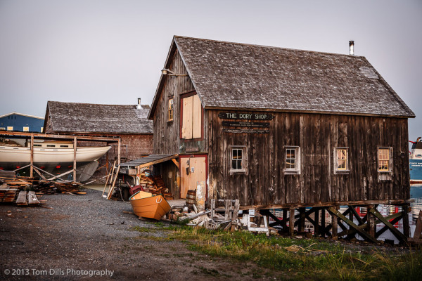
I’m still not convinced that this is the successful photograph I thought it would be when I made the frames, but I’ve enjoyed working on this one. I originally envisioned a high-contrast, low-saturation photo and thought it might work in monochrome, but (a) I think I’ll always be a color sort of guy, (b) I never did get the hang of what a black & white photo is “supposed” to look like, and (c) I might not be working on a good enough example. Hard to say.
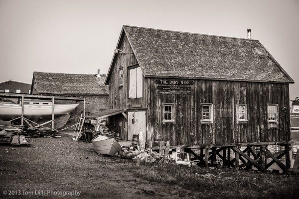
I think it’s a pretty interesting scene. It’s a little cluttered, but I feel it has good balance and good light. In the post sunset twilight I was trying to capture an old-timey look that would suggest a vintage photograph, although not necessarily black & white, rather than one taken with a new-fangled digital camera.
I’m not sure I know what “successful” means. Sure if the end photo lives up to the photographers initial expectations I guess that would be considered successful but I’m not sure that this “success” translates beyond that point to any other areas of consideration. This photo works for me. True it’s busy but that’s part of the visual story it tells — as a vibrant and active place of business. I like all the details it gives me a lot to explore.
As far as what a black and white photograph is “suppose” to look like, it beats me. I know some photos look better or convert better then others to black and white but for the life of me I’d be hard pressed to define any firm rules or guidelines to determine exactly which one’s do. This photo I like in color — I’d hate to have missed that pleasing pumpkin colored boat out front.
For me, a “successful” photograph means one where I end up with a photo – ideally a print – that lives up to my intention and expectation. I’m not quite there yet with this one.
I’m still really leaning towards the color version myself, as I think the touch of yellow is really what makes this photo work.
This is such a cool scene, so many details and points of interest. For me there is no question that colour looks better here because is adds to the overall impact created by the “busy-ness” of the scene. Colour helps differentiate the many parts. In the B&W image the parts blend into each other and feels far more subdued.
My thoughts on colour vs B&W has always been around the question “does colour add anything to the intended result?”. If not than I tend to convert to black and white though that is no guarantee that it will work in that format either; in which case I usually bin the photo. Black and white conversion for such a rich scene as your Dory Shop, requires (in my opinion) high tonal contrast to work. Low tonal contrast as in your b&w rendition works best with minimalistic scenes.
Anyway, that’s just an opinion so I wouldn’t attach much weight to it. In the end, whatever feels right to he who creates the image is what is truly appropriate.
I do appreciate your comments and opinions. I think it might still work as black and white, but I’ve got to spend some more time with it and see what I can come up with.