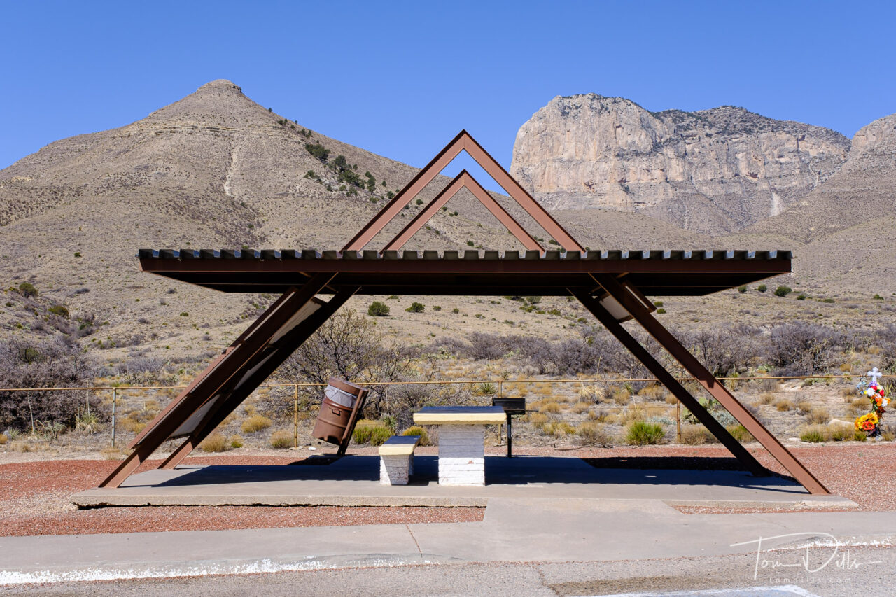
This is a bit of a photographers-only geek post, so bear with me. 😉
The latest update to Lightroom includes a set of “Premium” develop presets that were reportedly developed by photographers for use in streamlining the develop process. I’ve generally not been a fan of “canned” presets because I kinda have my own preferences and like to maintain control over my processing. But there is value to considering other approaches, and sometimes these presets are worth looking at, if only to get an idea for what is possible.
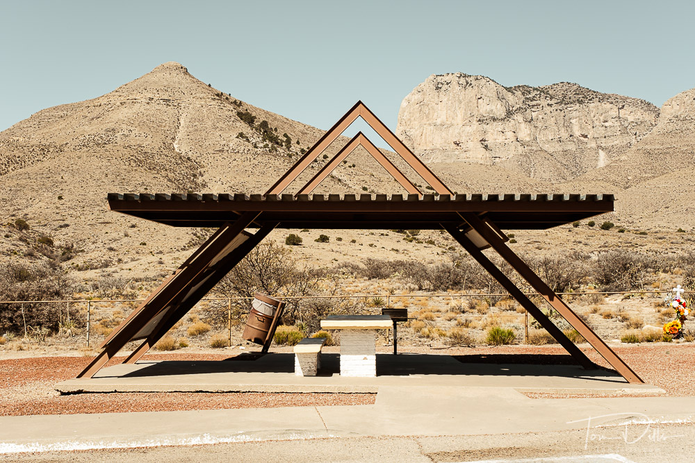
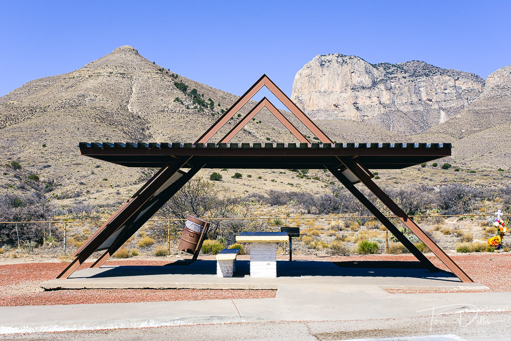
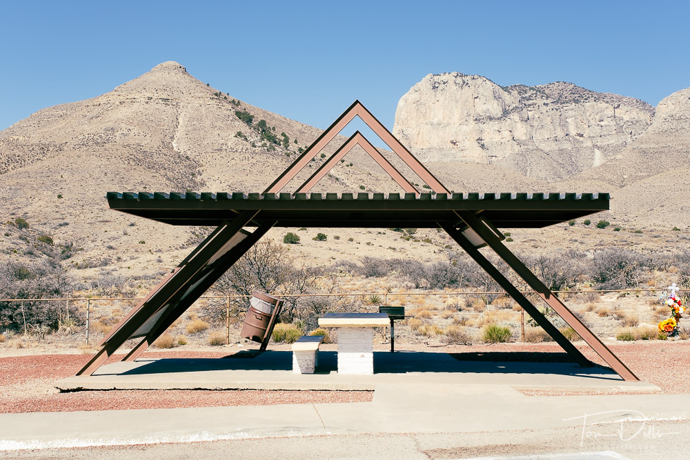
This morning I decided to take one of my photos from our recent road trip and try out the 10 presets contained in the “Travel” section. The results were pretty interesting so I thought I would share. The nice thing is that – as opposed to some of the previous presets – packaged as “Profiles” these appear to affect color balance and saturation and leave the other settings – noise reduction, sharpening, exposure, etc. – alone. I’ll learn more as I mess with the other ones, but I like the idea of coming up with variations just to see what they look like.
No conclusions here – just for evaluation and discussion. If anyone has comments – on the processing, not the photo 🙂 – I look forward to reading them.
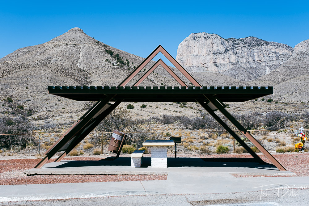
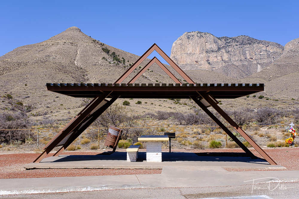
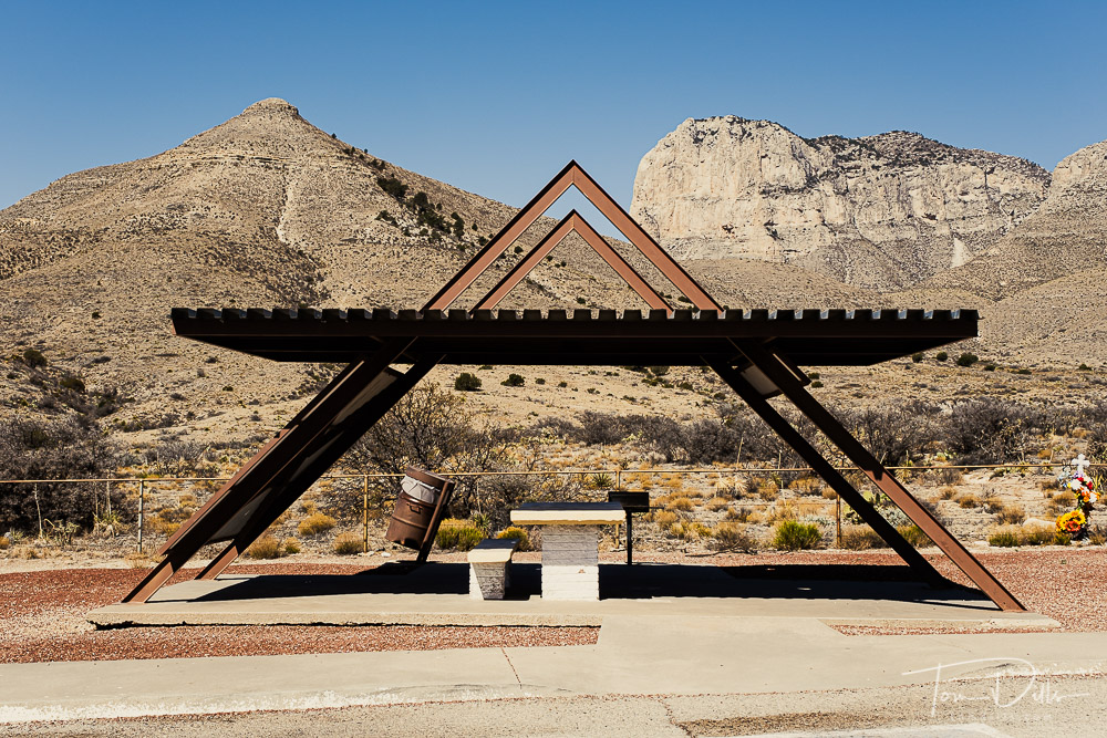
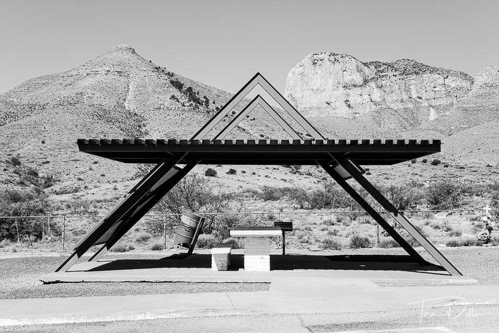
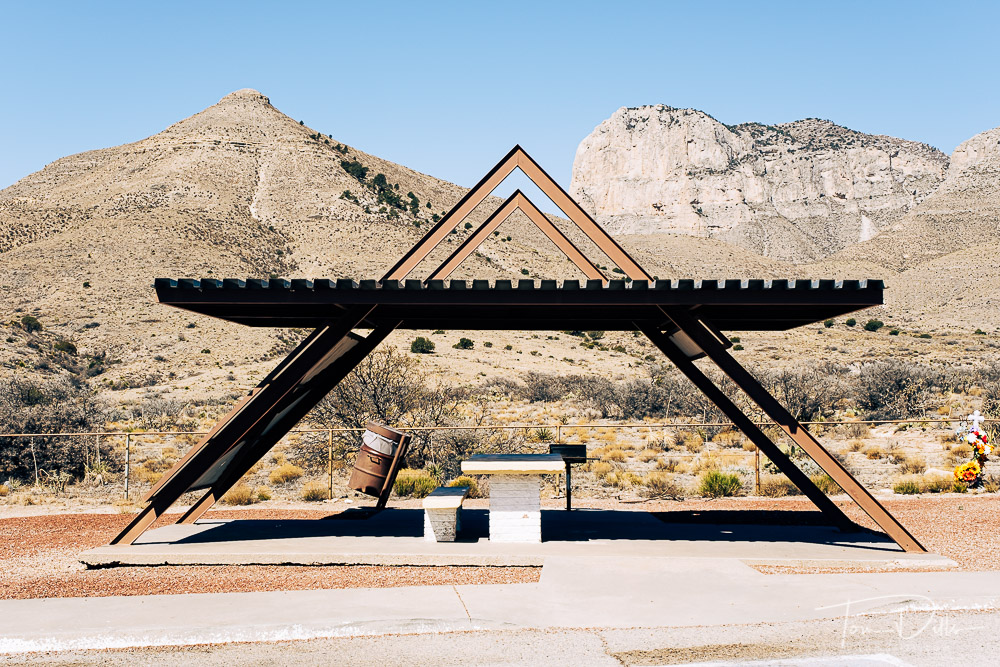
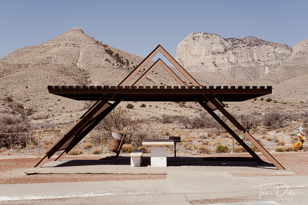
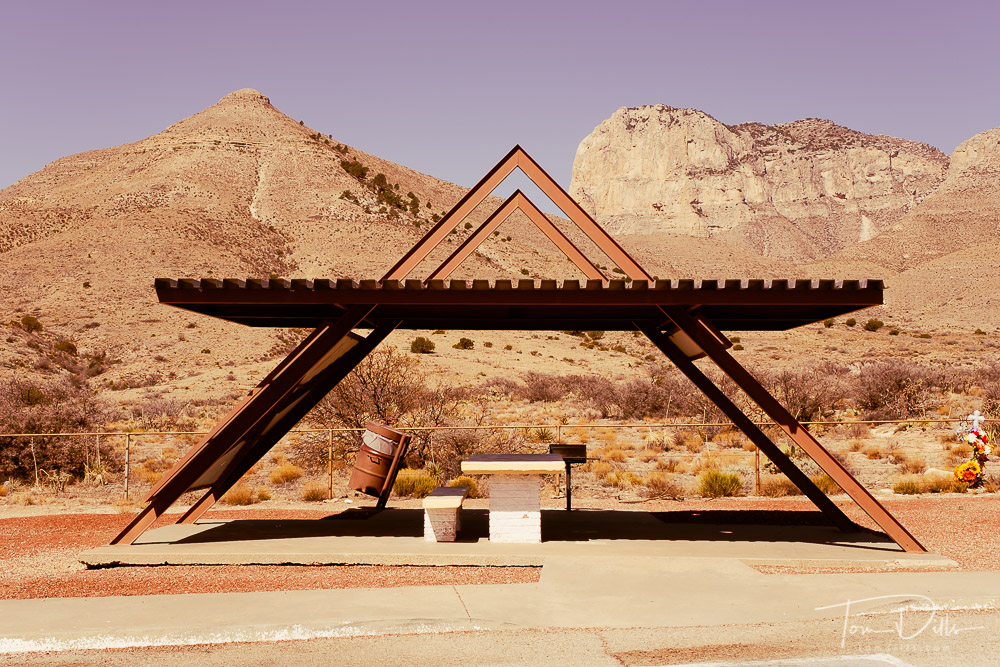

I’m with you in that I’m not generally a fan of presets. BUT… I do often find them to be a good starting point to think about a particular series or grouping of images. Start with the preset and then “season to taste.”
(turn on curmudgeon filter) I will say that sometimes, some presets end up looking like a roll of Kodacolor was left in the glove compartment of a hot car for 20 years and then developed. I guess a lot of the kids like that. (turn off curmudgeon filter)
My only problem with presets is that they actually slow you down sometimes. In some cases you can reach the result yourself plus benefit from making the changes incrementally. When I find one I really like I spend some time studying the sliders to understand, as much as possible, how the result was achieved. I have also found that with any preset you should immediately find the white and black point for the resulting image. This kind of fits the preset to YOUR image versus the one the maker used.
I can see where they would slow you down, Don. Especially if you felt like you needed to tweak every image individually. I do very little of that now with my own workflow, and would need to spend even more time if I was trying to come up with a different “look” that I liked.
I do like the idea of experimenting with a specific photo if the stock look was not what that imaged needed and I was trying to find one that worked. But applying it to a group of images – unless as Jeff implied you were trying to get a uniform look to a specific group of images – would just result in an alternative but not necessarily the best result.
I agree, Jeff! If I were to use the presets at all, it would be as a starting point for my own customized version, not just sticking with the stock settings. Years ago I was told that a photograph should not be “about the technique.” That probably referred to HDR, Lensbaby or some at-the-time fad, but still applies.
Curmudgeons R Us! I went through the “Cinematic,” “Futuristic” and “Vintage” collections hoping to find another group to experiment with on a different file, but thought they all looked like crap and can’t imagine what the appeal would be to anyone!
I’ve never created my own preset and have use very few in Lightroom, just because I’m lazy. I have a few simple basic things I do in my process and that’s about it.
Actually, Monte, creating a preset is the perfect solution for lazy photographers – that’s why I have them! 😉 I realized years ago that I almost always use the same basic treatment as a starting point, so I made that into a custom preset that I apply on import. It has evolved over the years as Lightroom has evolved and as my camera inventory has changed. But it’s still pretty much the same look as when I started.