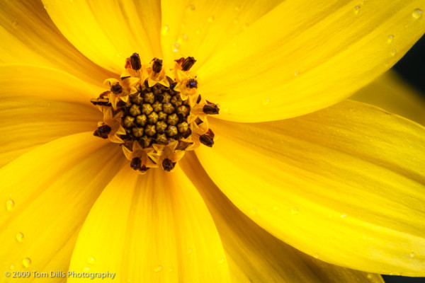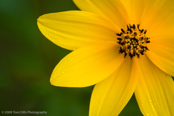
I recently sold a couple of prints to a repeat customer, and before I made the prints I went back over the files, as I often do, and made a few tweaks to take advantage of a more recent version of Lightroom than I used when I originally processed the photos a few years ago. As I was going through my library, specifically the folder where one of those prints resides, I went back and looked at some of the other photos in that folder. As often happens, a number of my “picks” for that day hadn’t been processed, and I was playing around to see what some of them might look like processed. I came across this version that I think I like even better than the first. It is a different flower, but the composition and the lighting make it a bit more dramatic than my original favorite. I made a small print of this one, but think I may have to go a little larger and make one to hang on the wall.
My “former favorite” is below. I’ll be interested in thoughts on how the two compare.


I agree with you on the “new” favorite. And, it’s also the composition that makes the difference for me. Both are beautiful captures with wonderful clarity and color. Of course water drops are the ideal accessories, aren’t they?
Thanks, Anita. I know that not everyone will agree, but I like the tighter composition, and I’m glad that you do. And yes, the dew drops were what I would call “gravy.”
Tom, I like the first image, the tighter one, best as well. It has greater “energy” and I appreciate the additional detail visible in the central bloom of the flower. Very nice.
The most difficult task for me as a photographer is choosing a favorite image. And, it it’s more than two I am going to have trouble. I like both of these but prefer the first one because of the crop and details are more vibrant.
I’m with the rest of the crowd. I like the first one a lot better. All of that yellow is just very inviting and the three water droplets in a row, perfect.